One of the most interesting papers I saw at the ASSA meetings in January was Ariel Ortiz-Bobea's new work on the climate and agriculture question. For anyone not in the know, there is a long (read: loooooooong) literature trying to estimate the effects climate change will have on agriculture. Most of this debate has focused on the US, largely for data reasons (and partly because US maize is way sexier than Kenyan maize...amirite?).
An overly brief summary of this literature is the following:
- In the Beginning, agronomists created the Crop Model. These models were created using test plots, and used to predict the effects of climate on agriculture.
- Then, some economists came along, and made the point that the agronomists were selling the farmers short. Crop models ignore the potential for farmer adaptation. And thus the Ricardian model was born: these economists regress land values on average temperatures, plus a bunch of controls, and find mild-to-positive effects of climate change.
- But wait! Enter Team ARE. A second set of economists argued that the Ricardian approach, like most cross-sectional regressions, suffered from omitted variable bias. In particular, they note that the presence of irrigation dramatically changes agriculture, and suggested estimating different models for irrigated and non-irrigated regions (if you're keeping score at home, you can also implement this suggestion via an interacted model). When they account for irrigation, climate change looks pretty bad again.
- A few years later, some other economists arrived on the scene. If you're worried about irrigation, they argued, you should be worried about a whole host of other omitted variables in the cross-section. But do we have the idea for you? These guys used a panel fixed effects model to remove time-invariant omitted variables - also sparking a debate about "weather vs. climate" (using short-run fluctuations rather than long-run variation to estimate the model in question) - and find again that climate change probably isn't so bad.
- Unnnnnfortunately, our panel-data-wielding heroes had some data problems (brought to light by Team ARE). If you correct them, climate change harms US agriculture to the tune of tens of billions of dollars. Oops.
- But the weather-vs-climate thing is still unsatisfying! So Team ARE: The Next Generation used a long-difference estimator to show that actually, farmers don't seem to be doing a better job responding to climate change over time - it'll still be bad.
Here's where Ariel's new paper comes along. He notes that (for various reasons glossed over above) we might actually want to run a Ricardian-style model: in essence, weather vs. climate hasn't been fully resolved. At the same time, though, we should be worried about omitted variable bias. But in particular, we should be worried about spatially-dependent omitted variable bias. The argument is pretty simple. Most things that might be left out of an agriculture-climate regression that would bias that regression vary smoothly over space. Conveniently for the econometrician, there are some newer estimators that we can use to understand the magnitude and direction of the bias that might result from these types of omitted variables. Ariel uses these tricks, and finds that (lo and behold) climate change might not be so bad for agriculture in the US after all.
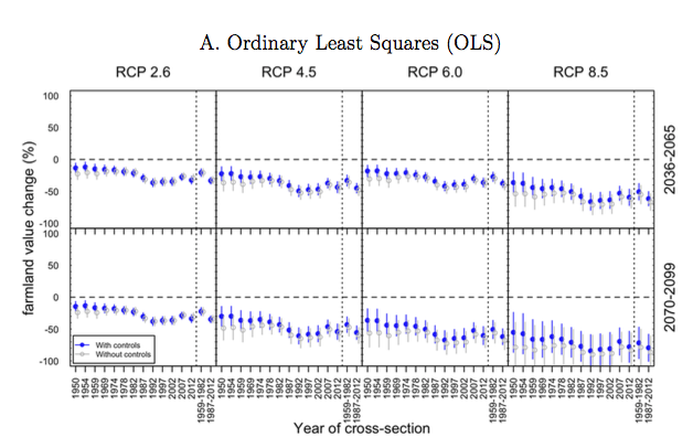
Effects of climate change estimated using OLS: this is the original economist version.

New-fangled effects of climate change using the Spatial Durbin Model. Note the lack of hugely negative effects, especially towards the right of the figure.
This paper is full of technical details, makes some fairly strong structural assumptions about exactly how omitted variables vary over space, and ends up with fairly wide confidence intervals, but all in all, it makes a useful contribution to an important debate, and is worth a read. I'll be interested to see where it ends up, and how seriously the literature takes the re-posited suggestion that climate change really isn't that bad for US ag. If nothing else, this paper highlights just how important it is for us to figure out how to measure adaptation!
Bonus: If you've read this far down, you deserve something fun. Go check out my new favorite internet game. h/t Susanna & Paula.
Edited to fix links. Thanks to my usual blog-police for pointing this out.


