As the semester winds to a close, I've been trying to get back into a better habit of reading new papers. Really, I'm just looking for more excuses to hang out at my local Blue Bottle coffee shop - great lighting, tasty snacks, wonderful caffeine, homegrown in Oakland...what more could I ask for? Sometimes doing lots of reading can feel like a slog - but this week, I stumbled across a really cool new working paper that's well worth a look. The paper, by Robin Burgess, Francisco Costa, and Ben Olken, is called "The Power of the State: National Borders and the Deforestation of the Amazon." Deforestation is a pretty big problem in the Amazon, especially when we think that (on top of the idea that we might want to be careful to protect exhaustible natural resources for their own sake, and not pave paradise to build a parking lot) tropical forests have a large role to play in combating climate change, because trees serve as a pretty darn effective carbon sink. Plus they produce oxygen. Win-win! Despite these benefits, trees are also lucrative, and there are also economic benefits to converting forests into farmland. This has led to a spate of deforestation.
To combat the destruction of the Amazon, Brazil enacted a series of anti-deforestation policies in 2005-06. It's important to understand whether these policies worked, and it's not obvious ex ante that they would: according to evidence from a friend (and badass spatial data guru/data scientist), Dan Hammer, a deforestation moratorium in Indonesia was unsuccessful: if anything, it led to an increased rate of deforestation. Oops.
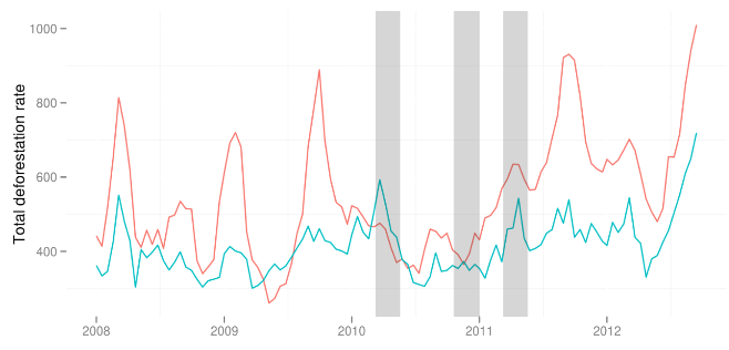
The key figure from Dan's paper. The grey bars indicate times when the Indonesian deforestation moratorium was in effect. The teal line is the deforestation rate in Malaysia, and the salmon line is the rate in Indonesia. Not much evidence here that Indonesia's deforestation rate decreased relative to Malayasia during (after) the gray periods.
The big challenging with studying deforestation, especially when it's been made illegal, is that it's tough to get data on. Going out and counting trees requires a huge effort, and people don't usually like to self-report illegal activity. Like Dan before them, Burgess, Costa, and Olken (hereafter BCO) turn to satellite imagery. As I've said before, I'm excited about the advances in remote sensing - there's an explosion of data, which can be harnessed to measure all kinds of things where we don't necessarily have good surveys (Marshall Burke, ahead of the curve as usual). BCO use 30 x 30 meter resolution data on forest cover from a paper published in Science - ahh, interdisciplinary (and a win for open data!).
Of course, it's not enough to just have a measurement of forest cover - in order to figure out the causal effect of Brazil's deforestation policies, the authors also need an identification strategy. Maybe this is because I've got regression discontinuities on the brain lately, but I think what BCO do is super cool. They use the border between Brazil and its neighbors in the Amazon to identify the effects of Brazil's policy. The argument is that, other than the deforestation policies in the different countries, parts of the Amazon just to the Brazilian side of the border look just like parts of the Amazon just to the opposite side of the border. This obviously isn't bullet-proof - you might worry that governance, institutions, infrastructure, populations, languages, etc change discontinuously at the border. They do some initial checks to show that this isn't true (including a nice anecdote where the Brazilian president-elect accidentally walked into Boliva for an hour before being stopped by the border patrol), which are decently compelling (though we're always worried about unobservables). Under this assumption, BCO run an RD comparing deforestation rates in Brazil to its neighbors:

The first key figure from BCO: in 2000, well before Brazil's aggressive anti-deforestation policies, the percent of forest cover was much lower on the Brazilian (right-hand) side of the border.
There's a clear visual difference between deforestation in Brazil and in its neighbors. But here's what I really like about the paper: even if you don't completely buy the static RD identifying assumption here, you have to agree that the following sequence of RD figures is pretty compelling.

This is a little annoying to compare to the first figure, since the y-axis here is different: this time, it's percent of forest cover lost each year - that's why Brazil appears higher in these figures than in the earlier graph. But: it clearly pops out that In 2006, when Brazil's policies went into effect, the discontinuity disappears.
The cool thing about the data that the authors have, which differentiates it from many spatial RD papers, is that it's not static - they've got multiple years of data. This allows them to look at deforestation over time. Critically, even though Brazil's forest cover is much lower than its neighbors prior to the policy, its annual rate of forest cover loss slows dramatically in 2006, when the deforestation policies came into effect, and appears to remain equal to the neighboring country rate in 2007 and 2008.
This is pretty strong evidence that the anti-deforestation policies put into place by the Brazilian government worked! You should still be slightly skeptical, and want to see a bunch of robustness checks (many of which are in the paper), but I really like this paper. It combines awesome remote sensing data with a quasi-experimental research design to study the effectiveness of important policies. It's not too often that we can be optimistic about the future of the Amazon - but it looks like we've got some reason to be hopeful here.
If you've made it all the way through this post, I'll reward you with John Oliver's new video on science.