Married and everything. Couldn't have asked for a better wedding, nor for a better trip to New Orleans!
To get back in the swing of things a little bit (no WWP from this weekend because I was happily banned from doing work): because my PhD (if and when I eventually get it) will say "Agricultural" on it, I guess I should occasionally post something about agriculture. To that end, a few quick things to highlight:
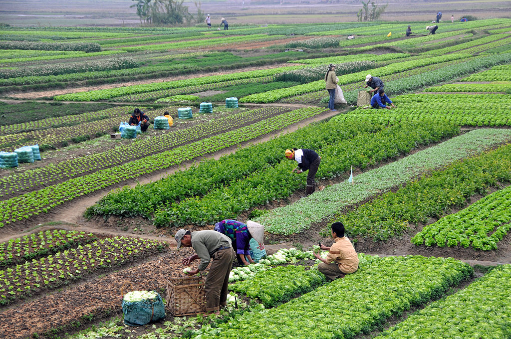
Interesting that this is the first picture that comes up when I Google-image search "agriculture." I was expecting US maize (which, to be fair, was the next hit...). Source.
- Mike Roberts' has a compelling blog post which was inspired by Angus Deaton's Nobel Prize victory (which, of course, happened while I was away - but it's great to see a development economist with a bent towards empirics being awarded the Prize). Mike (an ARE grad himself, no less) has a nice little piece about Deaton's work on commodity prices, and the value of fully thinking through the implications of estimated empirical results.
- Planet Money continues its run of excellent episodes with a cool discussion of futures markets. Definitely worth a listen.
- Finally, (not directly ag) Max Auffhammer points out that this new project "has famous econometricians in it."
Also, in totally non-economics-related news, I couldn't finish this blog post without highlighting my alma mater's excellent performances at the Head of the Charles this weekend. The men came 3rd, for their best placing since 2011, and the women (for whom I coxed while I was there) won for the first time since my senior year. Awesome.


