Weekend Op-Ed: Delhi driving restrictions actually work [so far]!

New semester, new blog-resolutions. We're back with a WWP...except that the analysis I'm talking about here hasn't actually made its way into a working paper yet. That said, the work is interesting and cool, and extremely policy-relevant, so it's worth taking a minute to discuss, I think.

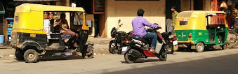
For those of you not up on your India news, Delhi's air pollution is horrendous. Air pollution data suggest that Delhi's PM2.5 and PM10 concentrations are the worst in the world - the city has even less breathable air than notoriously dirty Beijing. Having spent some time in Delhi last January, I can add some of my own anecdata (my new favorite Fowlie-ism) as well: after three days of staying and moving around in the city, I was hacking up a lung trying to walk up three flights of stairs to our airbnb. I'm certainly not the fittest environmental economist around, but a few steps don't usually give me trouble. 

So I was glad to hear that Delhi has recently been undertaking some efforts to improve its air quality. I was less glad to hear the method for doing so: between January 1 and January 15, Delhi implemented a pilot driving restriction. Cars with license plates ending in odd numbers would be allowed to drive on odd-numbered dates only, while cars with license plates ending in even numbers would be allowed to drive on even-numbered dates only. This sounds good - cutting the number of cars on the road by about half should have a drastic effect on air quality, right? The problem is that Mexico City has had a similar rule in place for years -  Hoy No Circula - and rockstar professor Lucas Davis took a look at its effects in a 2008 paper, published in the Journal of Political Economy. Unfortunately (I thought) for the Indian regulation, Lucas finds that license-plate-based restrictions lead to no detectable effect on air quality across a range of pollutants.

Here's Lucas' graphical evidence for Nitrogen Dioxide. If the policy had worked, we would've expected a discontinuous jump downwards at the gray vertical line. He shows similar figures for CO, NOx, Ozone, and SO2. 

Here's Lucas' graphical evidence for Nitrogen Dioxide. If the policy had worked, we would've expected a discontinuous jump downwards at the gray vertical line. He shows similar figures for CO, NOx, Ozone, and SO2. 

Lucas provides an interesting possible explanation for the lack of change: he has suggestive evidence that drivers responded to the regulation by buying additional vehicles - in the Delhi case, if I have a license plate ending in 1, but really value driving on even-numbered days, I might go out and get a car with a plate ending in 2 instead. In light of this evidence, I was less-than-optimistic about the Delhi case. 

So what actually happened in Delhi? New evidence from Michael Greenstone, Santosh Harish, Anant Sudarshan, and Rohini Pande suggests that the Delhi driving restriction pilot did have a meaningful effect on pollution levels - on the order of 10-13 percent! (A more detailed overview of what they did is available here). These authors use a difference-in-differences design, in which they compare Delhi to similar cities before and after the policy went into effect, doing something like this:

Effect = (Delhi - Others)_Post - (Delhi - Others)_Pre

Under the identifying assumption that Delhi and the chosen comparison cities were on parallel emissions trajectories before the program went into effect, this estimation strategy is nice because it removes common shocks in air pollution. The money figure from this analysis shows the dip in pollution in Delhi starkly:

It looks like, in its brief pilot, that Delhi was successful at reducing pollution using this policy. So why is the result so different than in Mexico City? Obviously, India and Mexico are very different contexts. It also seems like the channel Lucas highlighted, about vehicle owners purchasing more cars, is something that people would only do after being convinced that the policy would be permanent - so there might be additional adjustment that occurs that isn't picked up in a pilot like this. (Would you go out and buy a new car in response to someone telling you that over the next two weeks they're trying out a driving restriction? I don't think I have that kind of disposable income...) Also, the control group obviously matters a lot. I'd like to see (and expect to see, if this gets turned into an actual working paper) a further analysis of what's going on in the comparison cities over the same time period. The pollutants being measured are different - though I doubt that this actually affects much, given how highly correlated PM is with the pollutants measured in Lucas' paper. 

In general, I'm encouraged to see both that Delhi is taking active steps to attempt to reduce air pollution, and that these steps are being evaluated in credible ways. As the authors point out in their Op-Ed, and as I've tried to highlight above, we should be cautious about extrapolating the successes of this pilot to the long run - a congestion or emissions pricing scheme might be a more effective long-run approach to tackling air pollution.

I'd also like to briefly highlight the importance of making air pollution data available for these kinds of analysis. There's a cool new initiative online called OpenAQ that's trying to download administrative data from pollution  monitors and make this information publicly available - and they're not the only ones. Berkeley Earth is also providing some amazing data on Chinese air quality - and rumor has it they'll be adding more locations soon.  Understanding the implications of air quality on health, productivity, and welfare is increasingly important as developing country cities grow and house millions in dirty environments - the more data that's out there to aid in this effort, the better.

Lies, damn lies, and data visualization

A redundant trifecta? First of all, happy holidays, if you'd like, aka one of the few times of year I feel guilt-free about saying that I'm taking (shock and horror) two full days off! And for whomever of you is out there thinking "wait, but you're blogging...probably about economics"...hush. This blog isn't work (and as pretty much any academic economist will tell you, unless you're Chris Blattman, blogging won't help your career either)...[Lie or damn lie? You decide. I think we can clearly rule out data visualization on this one.]

I went to Edward Tufte's "Presenting Data and Information" one-day course in the city last week. If you're not already familiar with Tufte, you should be! He's one of the best writers out there on how to present data in an honest and compelling way, which is often under-appreciated by academic economists, I think.

The course was largely focused toward a corporate audience, but several of the general principles hold true in academia-land as well:

  • "Know your content" rather than "know your audience". In general, a guiding Tufte principle is that good content speaks for itself. Work to declutter your graphics/presentation so that your data/results are what pop out.
  • Be intellectually honest. I thought this goes without saying, but we've had a few recent egregious examples (see below) of badly misleading figures. Don't be a damn liar (and think about what you're presenting and how. Rules of thumb aren't always good).
  • Don't be afraid to integrate data with words. Good figure labels are essential, and annotative text can often help.
  • Social science is harder than real science [and also potentially has more transparency problems.]
Yikes.

Yikes.

Yikes, part 2.

Yikes, part 2.

Maybe none of these points seem super deep to you, but I think they're worth engaging with.

Tufte also spent a long time talking about presenting information in a way that allows the audience to take in your content in a (semi-)unguided manner before beginning to talk. The idea is to present a meeting audience with a handout when you walk in, and letting them read before you start clicking through slides. This helps get everyone on the same page, and also presents them with an opportunity to engage with material at their pace rather than making lots of people wait. Presenting information this way also allows people to dive deeper if they want - and a carefully crafted handout can do a lot in a page. Then when you actually start talking, you can have a more substantive, less hand-holdy discussion. Definitely interesting. Probably not going to be implemented in job talks any time soon, but the point about a carefully-crafted fluff-less written document is appealing in a field where papers are often 35+ pages (scientists manage to publish major work in 2 or 3, so...)

Other (random) things of note:

  • A paper I've been part of (with Catherine, Dave Rapson, Mar Reguant, and Chris Knittel) is being presented at the AEA meetings in January, in the "Evaluating Energy Efficiency Programs" session at (gulp) 8 AM on Jan. 3. Still very preliminary, but I think we're doing some cool things in incorporating machine learning with traditional econometric methods to exploit high-frequency electricity data. If you can suffer the early morning, come check it out!
  • Star Wars: The Force Awakens is awesome. Go see it if you haven't already! And if you have, shut up about the "they remade Episode IV" stuff. Similar plots? Sure. Was it still super awesome? 100%.
  • I basically missed out on all of the COP coverage, but hopefully this agreement represents some steps in the right direction.
  • My new Anova sous vide cooking toy has been a smashing success so far (neither Dana nor I has been harmed yet). 
  • Grist has some compelling maps.
  • The Economist has an infographic advent calendar. 
  • And, finally, on an optimistic note, Quartz's Chart of the Year shows the dramatic decline in people living in poverty over the last 200 years or so. We're doing a lot of things wrong these days, but it's nice to see clear graphical evidence that we're actually doing some stuff right.

That's it - stop reading this and go do something fun/outside/etc!


What do autorickshaws and blood diamonds have in common?

One of my favorite things about urban India is the wide range of transportation options. You can travel by foot, (in Jaipur: camel or elephant), bike, old-school rickshaw, scooter, motorcycle, autorickshaw, car, bus, or metro. 

As you might have guessed, though, there's a cost to all of these amazing methods for getting around: local air pollution is through the roof. Delhi was recently named the most polluted city in the world, with PM 2.5 concentrations one-and-a-half times higher than Beijing last week (Beijing, mind you, issued its first-ever air pollution "red alert" on Monday, bringing the city to a standstill). Bangalore, where we currently are, feels noticeably better than Delhi, but has its own pollution problem as well.

We've been doing the majority of our getting around using autorickshaws, amazing motorized three-wheeled contraptions which can weave between buses, fit two comfortably on the back seat, and are (to a Westerner, at least) dirt cheap. Plus they're fun and exciting, but don't come with the terror of being on the back of a motorcycle. 

Bangalore's autorickshaw fleet is composed of two types of vehicles: those with two-stroke (petrol) motors, and those with four-stroke motors (LPG). They're conveniently color-coded: the dirty ones are painted black, whereas the clean(er) ones are a beautiful green color. Oh, the symbolism! The good they provide, however, is identical. Fares are the same across rickshaws, and the ride quality/speed/etc is basically indistinguishable as well. The dirty ones are supposedly being phased out over time - newly purchased rickshaws have to be the clean variety - but there are still plenty in the fleet. Because we're good little environmentalists, Louis and I have been trying to take the LPG ones whenever possible.

Ready to be hired!

Ready to be hired!

...Except that all that we're getting by avoiding black ricks is green glow. The rickshaw situation reminds Louis (who is "finishing [his] PhD and doesn't have time to [guest post on my] blog") and I (therefore taking the credit) of blood diamonds, thanks to Catherine, Jim Bushnell, and Carla Peterman

Humor me for a second here. Suppose we have a world with 5 potential rickshaw riders (diamond buyers), and 5 potential rickshaw rides (diamonds). Initially, transportation services (diamonds) are seen as homogenous, but in reality, there are 2 rides available in dirty rickshaws (blood diamonds). Louis and I decide to boycott these dirty rides (blood diamonds), and commit to only riding in the 3 remaining clean rickshaws (buying conflict-free diamonds). The other three consumers in the market are indifferent - so long as they get from point A to point B (have a diamond), they're happy. The end result? We ride only in green rickshaws (buy clean diamonds) and get our green glow, but pollution (diamond-driven conflict) hasn't actually changed, because we just swap rickshaws (diamonds) with the remaining 3 buyers in the market.

If we wanted to actually effect change, the share of clean-only riders in the market would have to be larger than the fraction of green rickshaws. To see this, suppose there are still 3 clean rickshaws, but now we've got 4 green-only riders. In this scenario, the total number of rides consumed drops from 5 to 4 (one green-only rider will be unable to find a clean rickshaw and will refuse to ride), and the ride that isn't taken is a dirty ride. Cool. But unlikely to be the situation in urban India, where people seem to be pretty indifferent about their rickshaw colors.

Jim Bushnell's neat figure illustrating the successful-boycott case. Borrowed from a set of slides on reshuffling.

Jim Bushnell's neat figure illustrating the successful-boycott case. Borrowed from a set of slides on reshuffling.

Looks like we're probably stuck with just green (rickshaw) glow for now. But on the off chance we might end up on the margin (and because, let's admit it, green glow feels good!), we'll keep riding the LPG rickshaws if we've got the choice. 

Officially SSMART!

I've been a bad blogger over the past month or so, something I'm hoping to remedy over the coming weeks. (Somewhere out there, a behavioral economist is grumbling about me being present-biased and naive about it. Whatever, grumbly behavioral economist.) I'm writing this from SFO, about to head off to Bangalore (via Seattle and Paris, where I'll meet my coauthor/adventure buddy Louis), thanks to USAID and Berkeley's Development Impact Lab. We're hoping to study the effects of the smartgrid in urban India, as well as to learn more about what energy consumption looks like in Bangalore in general. There is a small but quickly-growing body of evidence on energy use in developing countries (see Gertler, Shelef, Wolfram, and Fuchs -- forthcoming AER, and one of my favorite of Catherine's papers! -- and Jack and Smith -- AER P&P on pre-paid metering in South Africa -- for a couple of recent examples). Still, there's a lot that we don't know, and, of course, a lot more that we don't know that we don't know. Thanks a lot, Rumsfeld.

Feeling SSMARTer already!

Feeling SSMARTer already!

In other exciting news, the Berkeley Initiative for Transparency in the Social Sciences (BITSS) has released its SSMART grant awardees - and my new project (with Matt and Louis, and overseen by Catherine) on improving power calculations and making sure researchers get their standard errors right has been funded! Very exciting. Check out the official announcement here, and our page on the Open Science Framework here. Since this is a grant explicitly about transparency, we'll be making our results public as we go through the process. Our money is officially for this coming summer, so look for an update / more details in a few months.

Where we are currently: there are theoretical reasons to be handling standard errors differently than we currently are in a lot of empirical applications, and there are also theoretical reasons that existing formula-based power calculations might be ending up under powered. In progress: how badly wrong are we when we use current methods? 

My flight is boarding, so I'll leave you with that lovely teaser!

Conference recap: IGC's Energy and Growth

Last week, I was lucky to have been invited to the IGC’s first annual (we hope!) Energy and Growth conference in London. Organized by heavy-hitter energy economists Michael Greenstone and Nick Ryan, this cool conference brought together economists who work on energy and development with policymakers from a range of international organizations and governments. The IGC seems to have facilitated many useful collaborations between researchers and the ``real world,’’ and this was an interesting venue to highlight some of that work (and some other work as well). A few highlights:

  • Not to plug my advisor again, but I can’t help it: Catherine’s work with Ted Miguel and Ken Lee (fellow ARE PhD student) on an RCT they’re conducting in Kenya might have been the hit of the conference. First, they noticed that a large number of households were “under-grid”, or had electricity infrastructure nearby, but not in, their homes. This is an example of the last mile (last centimeter?) problem. They’ve randomly assigned subsidies for grid connections to households in rural villages, and have varied the subsidy level across villages, letting them estimate a demand curve for electrification among these households. They also have cost information from the Kenyan Rural Electrification Authority, so that they can estimate a supply curve as well. The surprising punchline? The supply curve sits above the demand curve basically everywhere: households aren’t interested in taking up connections at the cost at which the Kenyan government can provide them. Also some cool stuff about credit constraints. I’d be interested in learning more about what’s driving this effect: is it concerns about reliability? Lack of information about the power of electricity (eheheh)? Something else? They’re also conducting a follow-up survey which will let them understand the effects of electrification in these regions, which will also hopefully shed some light on what’s going on here. Fascinating stuff.
  • Kelsey Jack has some really cool new work with Grant Smith (PhD student at UCT – one of my favorite places) on the consequences of pre-paid electricity metering in Cape Town, also using an RCT. When these meters are installed, some households do reduce their energy consumption – but many also dramatically increase their electricity-related transactions costs, by going to the shop to fill their meters multiple times a week. It turns out that pre-paid meters don’t substantially reduce consumption of the households that are being subsidized, and do reduce consumption among the subsidizers, so they don’t seem to be an effective tactic for additional revenue recovery, either. Again, lots more to be learned about pre-paid metering. I’m hopeful that they’ll be able to expand their study area as well.

·      Koichiro Ito has new work looking at willingness to pay for air quality in China, exploiting the Huai River discontinuity. While I’ve always been highly skeptical of a certain previous paper using this result (sorry, MG), this one is definitely more convincing, in particular because it measures PM10 which is a fairly local pollutant, because it includes longitude controls, and, most importantly, because the effect is only visible in the winter. Combining this with scanner data on retail outlet purchases of air purifiers, Koichiro is able to give us what’s probably a lower bound on the Chinese WTP for air quality (and in turn, quite a low VSL – though not so low as Kremer et al found using clean water in Kenya). I want to see more about getting from this number to an implied VSL, and the discount rates or lack of information that would have to be required to rationalize a VSL closer to the one we use in the US, but that should be doable in a fairly simple back-of-the-envelope calculation. Neat!

  • Rohini Pande made some insightful comments as part of a panel discussion about the importance of government oversight and regulatory strength in keeping local and global pollutants managed in the context of growing energy demand in the developing world. It sounds like she’s also got some interesting new work about the placement of energy infrastructure: should it be near people (ala China) or near coal (ala India)? These have vastly different distributional consequences, which we know from some of her earlier work (“Dams” with Esther Duflo) can be very important. Looking forward to seeing what she does. One of my favorite researchers.

Lots of other interesting work was also presented (check the program for some details); I’m inspired to do more work in this area. There are obviously a number of smart people working in this space – but luckily it’s a vast and important research space, so hopefully there’s room for another grad student or two.


Stay tuned to this blog for the next few weeks for a couple of exciting announcements about upcoming work and new results!